The Case Study
In March 2018, I began working as the Design Manager & Marketing Assistant at Live It Travel. I was entirely responsible for the re-design of the bussineses website. Click the link to view the website or continue reading for the case study documenting my process.
Overview
Live It Travel is a boutique full service travel agency. They specialize in organising unique overseas experiences and custom designed travel itineraries. When I started working at Live It Travel their website was unresponsive, outdated and under performing.
The Problem
While an update was clearly needed, the sales team also expressed concerns regarding the lack of customer enquiries coming from the website. They felt large sales opportunities were being missed, due to the majority of enquiries being received via the phone. I saw this as a great opportunity to apply my knowledge of UX design and help solve the problem.
The Goal
I made it my goal to understand why this problem was happening and to figure out what I could do to make the website function better. I also wanted to enhance the the overall look and feel of the website, to better align with how the company was positioning itself as a boutique travel agency.
D I S C O V E R Y
Gathering Insights
Before designing anything, I needed to focus on finding exactly where the problems were occurring and gaining a deeper understanding of what the users pain points were.
D I S C O V E R Y
Quantitative Research
With the user in mind, I began the discovery phase by investigating the websites analytic data. Understanding the story within the data would help me identify clues to the problems users were facing. Sure enough, the data showed some clear issues with the website.
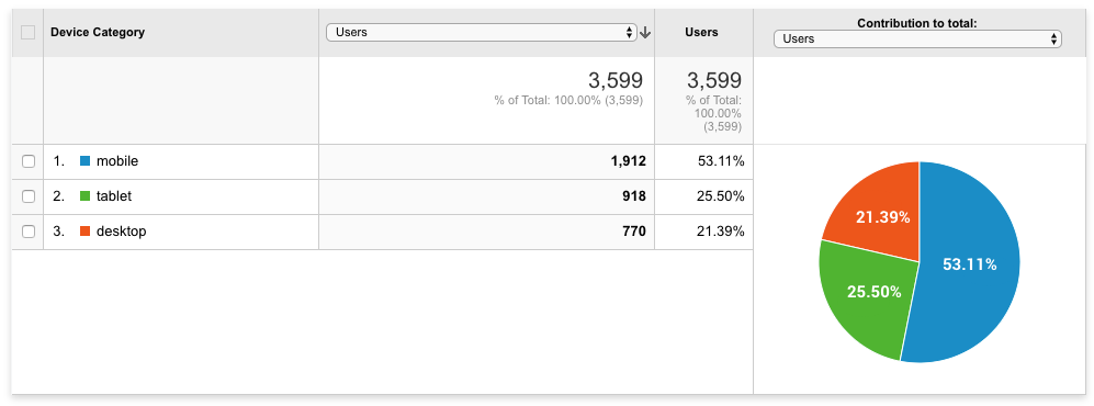
Google Analytics Device Analysis
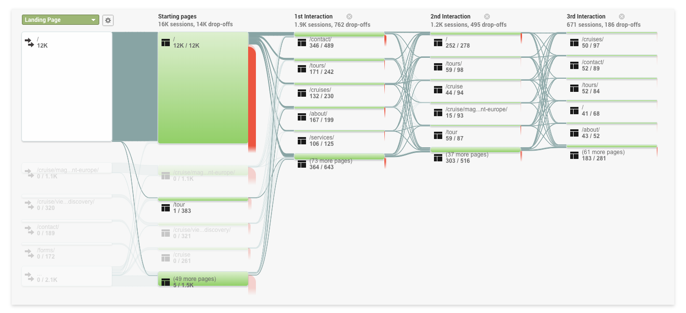
Google Analytics Behaviour Analysis
Key Findings:
Non-Responsive Website Views
53% of users were viewing the non-responsive website using mobile devices. It was clear users were finding it difficult to navigate through the website and view its content.
Hard To Find What They Came Looking For
Looking at the behavior analysis, users who made it beyond the first interaction were often clicking back and forth between tours and cruises. The reason is unclear but the behavior suggests they might be having trouble finding information relevant to them.
Contact Was Important
The most popular action users were taking was to contact the store. Using this metric to my advantage, I could find a more efficient way for customers to complete this task.
D I S C O V E R Y
Qualitative Research
While the analytic data was a helpful insight, I needed more information to fully understand the situation. I set up meetings with the sales team to find out what customers most common pain points and frequently asked questions were when enquiring over the phone.
Key Findings:
Needing A Quote
Customers who already knew where they wanted to go and just wanted a quote.
Options Within A Specific Region
Customers wanted to know what options were available to them when traveling to a specific country or region of the world.
Available Options Based On The Style Of Travel
Other customers wanted to know what options were available based on a specific style of travel, such as, a Safari or a All-inclusive resort.
D I S C O V E R Y
Business Needs
Gaining the customers trust was a huge priority for the business, especially in an industry with large competitors. The business also wanted to communicate better with their unique selling point (USP) of being able to provide customers with a more personal service due to the smaller boutique size of the company.
D I S C O V E R Y
Competitive Analysis
Getting a broad view of what other businesses were doing in this space was also very important. Learning what the bigger names in the industry were doing such as, Flight Centre, Web Jet, STA Travel, and Helloworld would allow me to find key features, best practices, and opportunities to differentiate when moving forward with my design.
U S E R P E R S O N A S
Creating User Personas
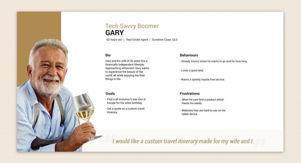
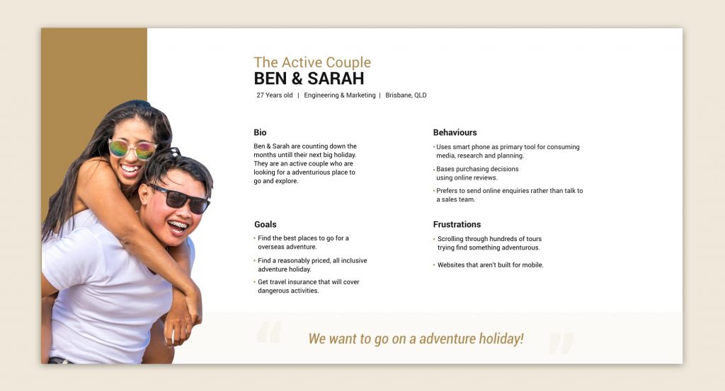
With the insights gathered from the discovery phase, I could now create User Personas focusing on the most common issues users were facing. These personas were based on a combination of common types of customers who had either booked a trip already or made an enquiry.
U S E R F L O W
Improving The Task Flow
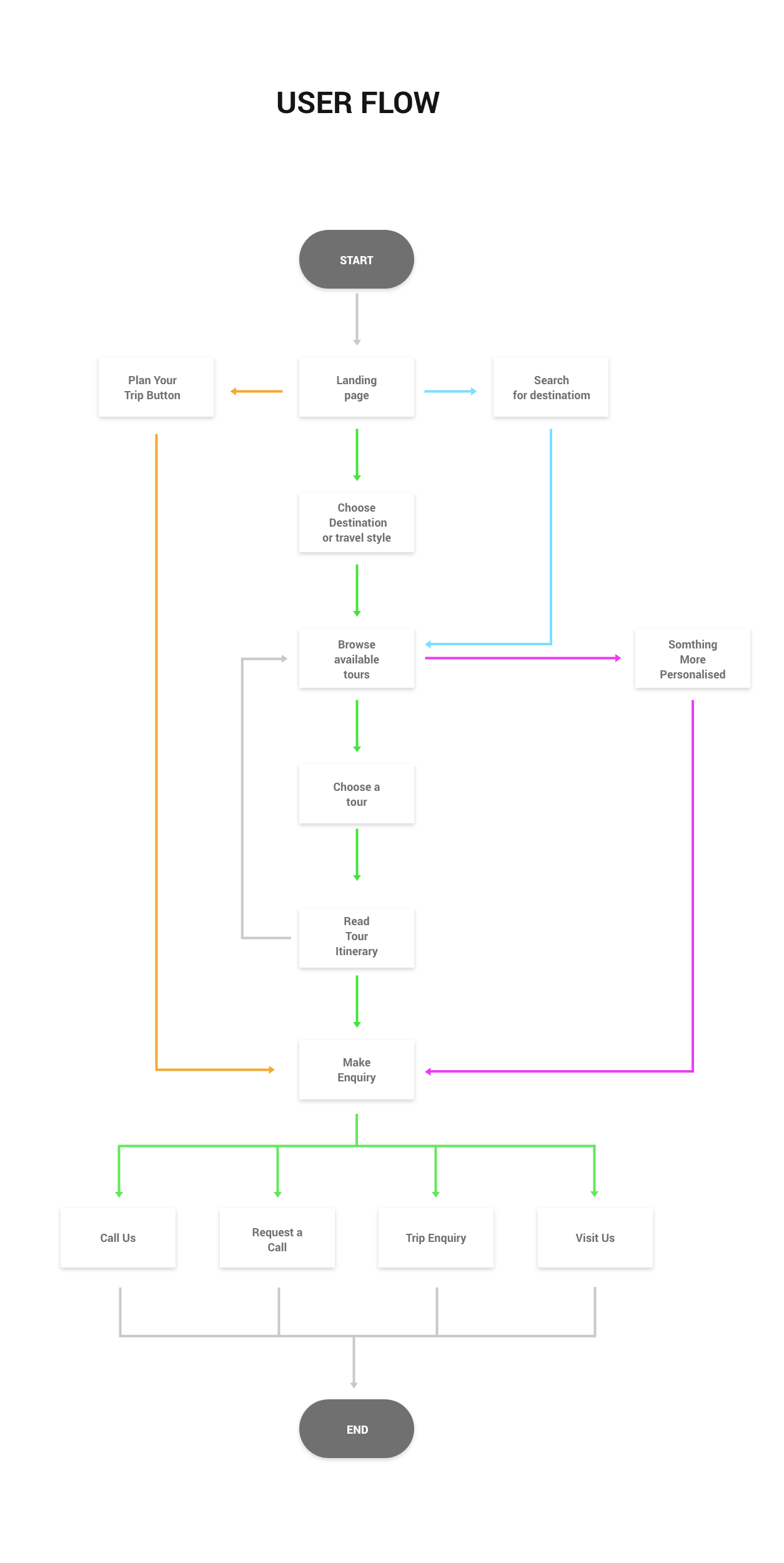
With the information I gained from the discovery phase, I began improving the path a customer could take when trying to achieve a desired task. I focused on finding the most efficient way users could search, browse, and enquire about trips they were interested in. After an iterative process, I was able to settle on a simple, yet efficient user-flow.
W I R E F R A M I N G
Creating Wireframes
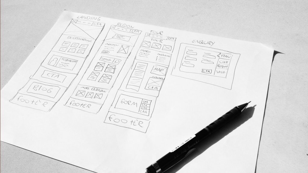
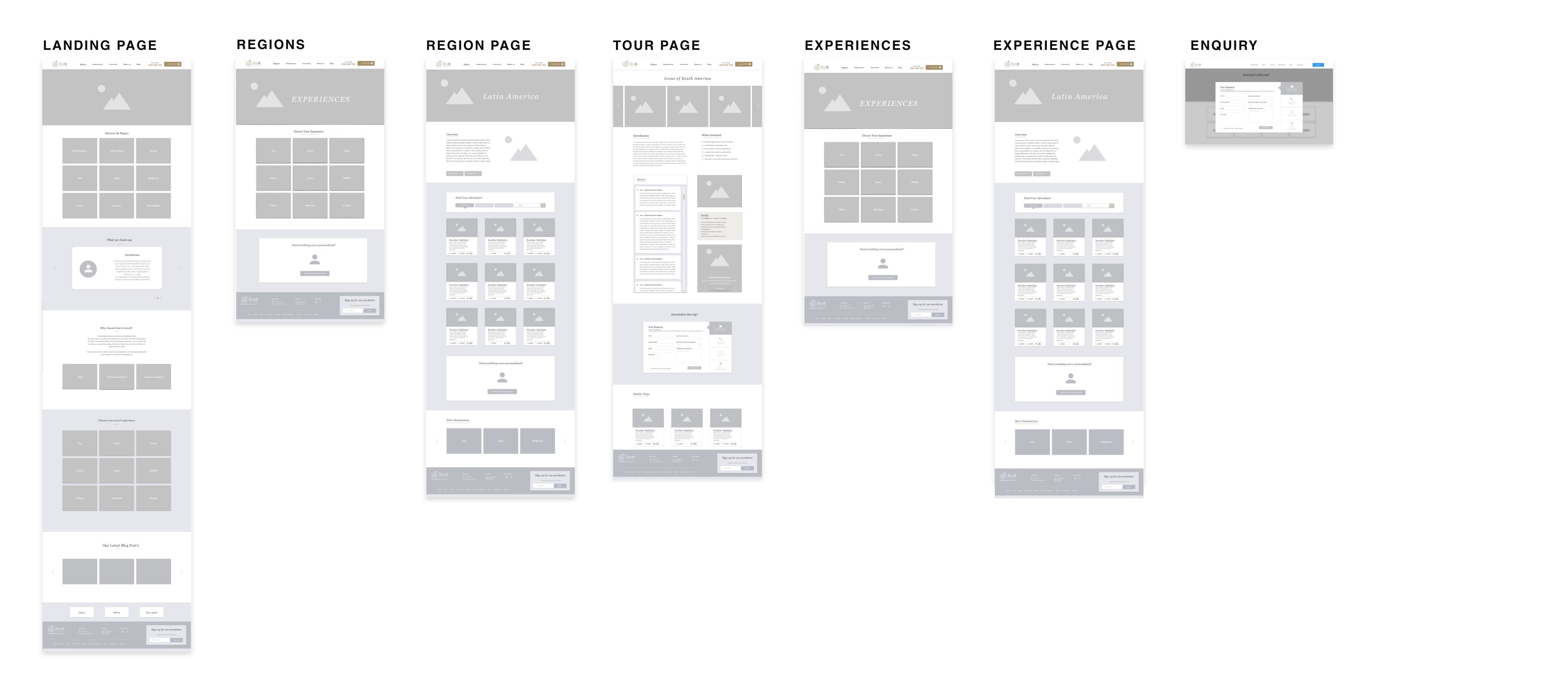
With the user’s pain points in mind as well as, the needs of the business I began creating wireframes. This was also an iterative process which helped decide what features should exist on each page and in what order. The goal was to find the most functional and user-friendly way to layout each page. Once I was happy with the functionality, I turned the sketches into high fidelity wireframes using Adobe Xd.
V I S U A L D E S I G N
Enhancing The Branding
The previous branding was quite strong, but the business needed to make some adjustments to better position themselves as a smaller boutique agency. I wanted to make some changes to better portray this boutique feel while also keeping some well-established brand elements.
Colour
The previous colour scheme used Gold as the dominant colour with Burgundy and Navy as contrasting accent colours. To give the brand a clean, modern and sophisticated look I chose a warm neutral colour pallet. The idea was to emphasize the brands iconic Gold and use it to highlight the calls to action (CTA) throughout the website.

Typography
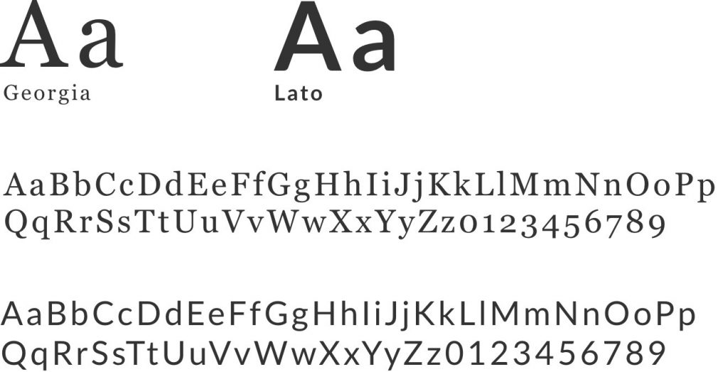
Georgia is a Serif typeface, which appears elegant but also very legible. It helps give the brand a higher-end feel which reflects the boutique style of travel products the business provides to customers.
Lato is a simple and readable sans-serif typeface. Its semi-rounded details and strong structure give it a feeling of seriousness while still being friendly which is a great representation of the brands values.
Iconography
I decided to add a new set of icons to the existing selection. This decision was to help represent the new categories of travel styles I was introducing. The icons would help users easily identify which travel style a specific tour is. Such as a cruise, adventure, culinary, safari, group or culture tour.
T H E F I N A L D E S I G N
Bringing It All Together
It was now time to bring all the hard work together for the final design. The new features are focused on allowing users to easily make online enquiries and find relevant tours quickly.
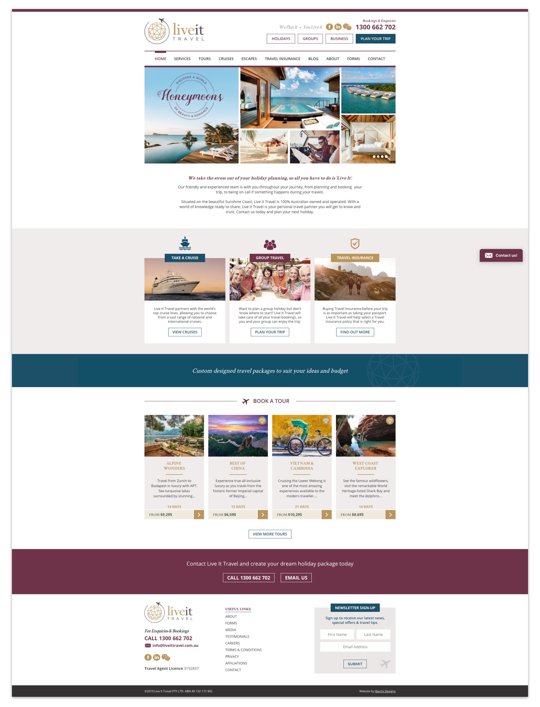
The Original Website
Below is a screenshot of the original website design for reference.
T H E F I N A L D E S I G N
The New Website
For the re-design of the website, I worked specifically on making online enquiries easier to perform and improving the way users can find relevant tours and information. The new design includes new user friendly features, a new layout, and a much improved look and feel.
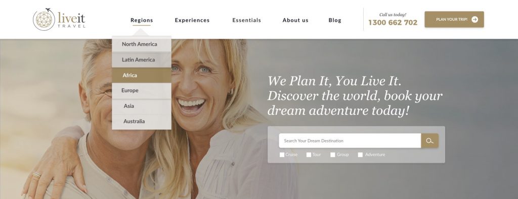
Menu Options & Search Bar
By prioritizing the information users were seeking on our website and re-categorising a number of obvious menu options, I was able to reduce and simplify the design. I also included a new search bar to help users quickly find what they came looking for.
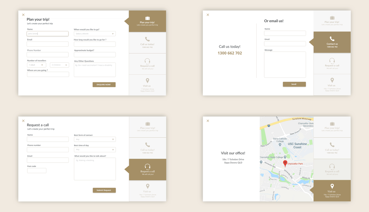
Plan Your Trip Form
To improve the number of enquires on the website, I decided to re-design the way users could make enquires. The Previous form was very long and time consuming to complete. Researching into how our competitors solved this problem, I designed a new enquiry form, which offers multiple options of making contact with our travel agents.
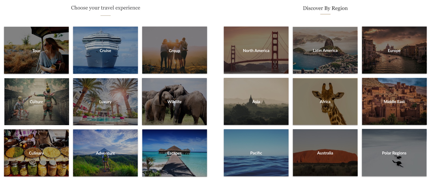
Searching By Region Or Experience
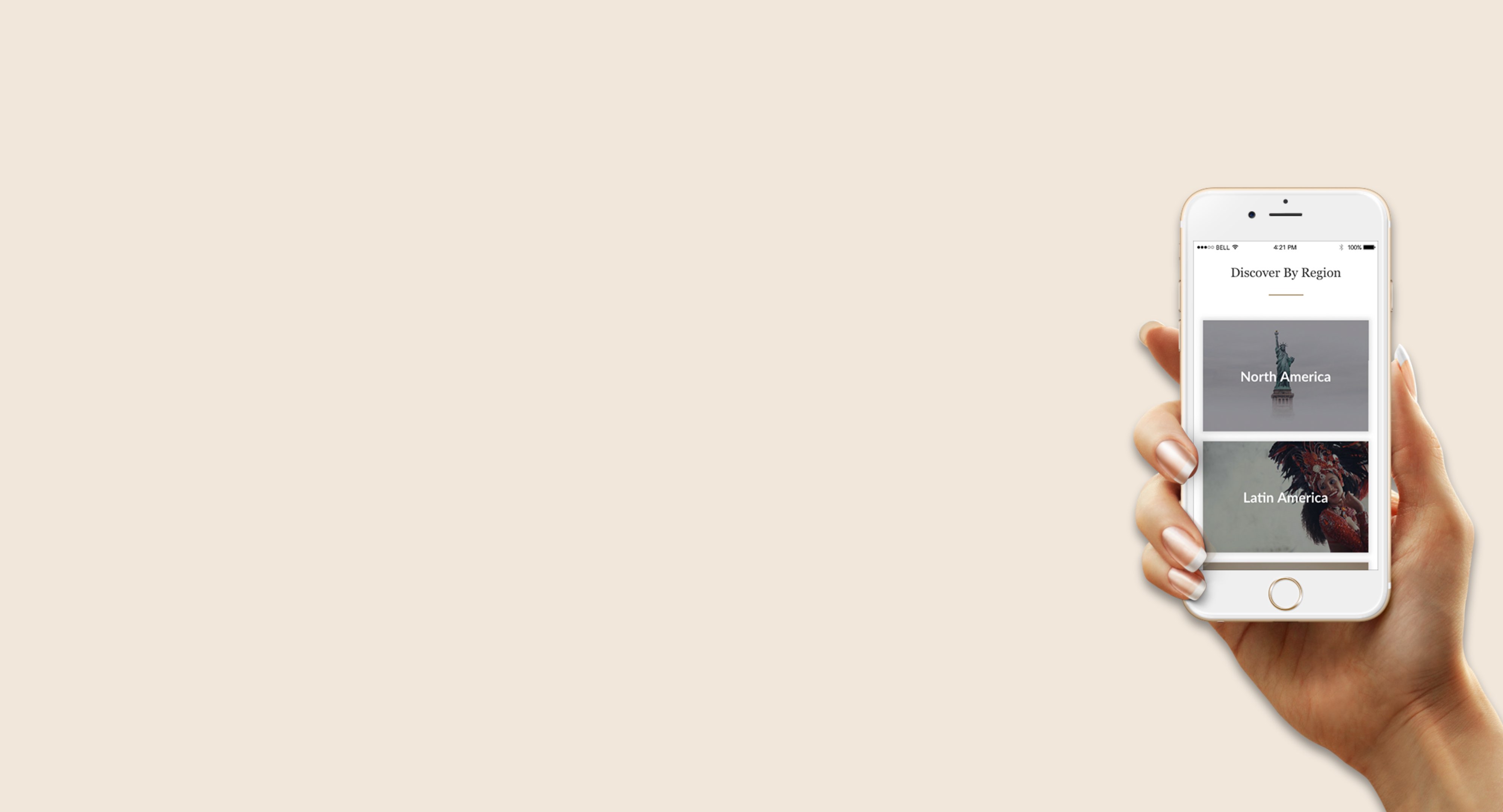
By Introducing category tiles to the landing page, it quickly allows users to browse different travel options by either a specific region or travel style. This helps guide the user to the content relevant to them.
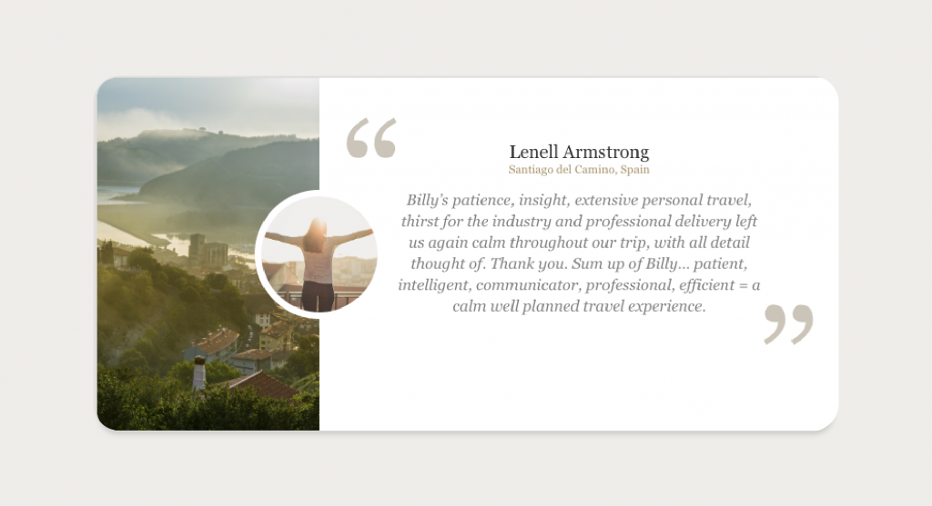
Adding Social Proof To Build Brand Credibility
I added a testimonials section to the landing page to help highlight the businesses credibility and build trust with customers. Having this social poof clearly visible allows users to see that the business can be trusted and increases the potential for more enquiries.
C O N C L U S I O N
Lessons Learned
The project was a great learning experience. I was able to push myself and get a real understanding of how much work goes into the process.
I am happy with what I was able to achieve with the limited experience and resources available, But there are defiantly things that could be improved. I wasn’t able to do real user interviews or user testing as the business did not have the funds or resources. I feel collecting more data in interviews and user testing would have helped to better identify peoples needs and expose any issues in the design.
Next time I would love to work alongside another designer for more feedback and different ideas. Overall, I’m pleased with how the website turned out and feel confident that I have improved the user experience and visual design of the website.
